3. Colour matching
With the detail of the artwork complete, the legend colours and background shade now require modifying to visually approximate those used in an original dial. This introduces the problem of colour variation.
It will be appreciated that the exact colour shades displayed by one computer monitor will vary with respect to another. In the same way, the actual colours that are printed by a particular printer will similarly vary with respect to those shown by a monitor.
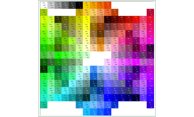
In order to achieve the correct colour values required I first printed several colour swatches. Each square of colour has its RGB values printed on it, and when printed by your printer will give you a permanent reference chart so you can determine exactly how your own printer will produce a specific colour combination.
It is necessary to print on exactly the same sort of paper and with the same printer settings as those intended to print the artworks with or the colour chart will be invalid.
The problem of colour matching is not only confined to the differences between what a particular monitor displays and what a particular printer actually produces. The human eye perceives colour hue and saturation differently in response to contrast.
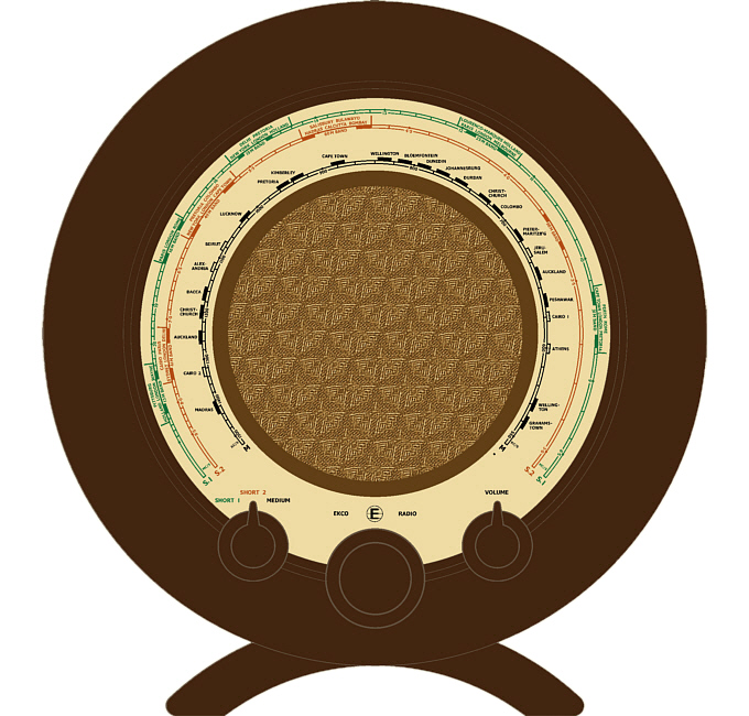
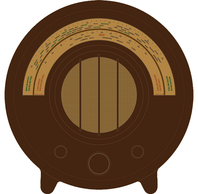
Put in terms of colour matching a reproduction dial, if a dial artwork is viewed against a light backdrop then the shade used for the background of the dial will appear darker than if the same artwork is viewed against a dark backdrop.
I had not realised just how striking this effect can be until I began experimenting with printing my reproduction dials a couple of years ago. Often the background shade of the artwork that came out of the printer looked too dark against the white of the photo paper I was using, until I trimmed and test fitted it into an actual bakelite case when the same dial background then looked too light.
To overcome this problem I created a graphic versions of A22 and AD65 bakelite cases that I could test fit the artworks into "virtually" before physically printing them out.
This method is not perfect, but what it does do very well is give a close "ball-park" figure for the RGB colour values of the required background shade. It is then a case of "tweaking" this value until a final shade is found that is visually pleasing and acceptable.